

We are proud to announce the launch of the new company logo as part of the ongoing evolution of our company’s brand.
Our business has grown and evolved over the last 15 years, and we felt it was time to change. We have refreshed our logo to reflect who we are today and to symbolize our future.
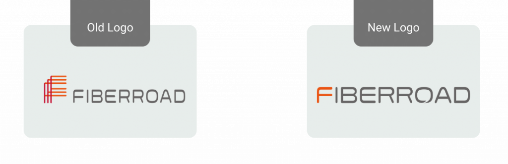
After careful consideration, we chose a new logo that reflects a more modern look and captures our vision to position Fiberroad as the most innovative and reliable technology for Industrial Ethernet and Optical Transport.
The new logo line is simple, clean, easy to remember, and easily identifiable. A new logo and trademark are combined, along with the company’s name (Fiberroad) and official website domain name. The new logo expresses the company’s mission and symbolizes its development in optical communications. The first character in the new logo inherits the colour system of the old logo, with orange as the standard colour, representing the company’s team has always been hot and full of positive attitude towards customers and work.
We are also glad to introduce our new Website to present ourselves better and create a clear picture of our technology and presence in the world.
The task in the upcoming months will be to update all our documents, uniforms, business cards, etc with the new logo. We realize that changing a logo is a process that can involve many steps and take some time so we will finalize it gradually.
If you have used the Fiberroad logo in any of your marketing materials, please assist us in updating them. We appreciate your kind support. If you have any questions, please don’t hesitate to contact us.